Attleborough House Prices: What’s Happened in the Last 5 Years
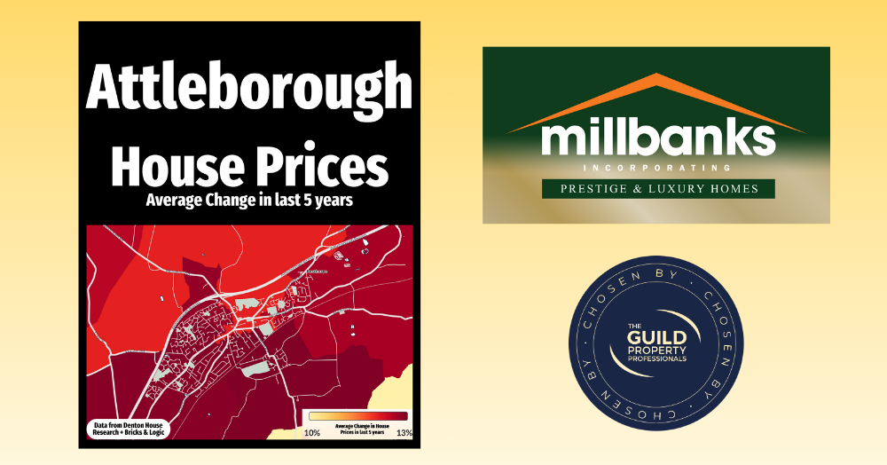
This visual snapshot reveals how property values rarely move in unison. Some streets surge ahead, others advance more quietly, each following its own rhythm. It’s a reminder that markets are made of micro stories, where proximity alone doesn’t guarantee the same outcome.
This map shows how house prices have changed across Attleborough over the past 5 years. Any blue areas shows any drop in house prices. The lighter yellow areas represent the parts of Attleborough where average house prices have seen smallest rises, the orange shades in the middle increases, while any deeper reds show the strongest house price growth.
It is a fascinating picture because it highlights how no two areas perform in quite the same way. Even within the same town, some pockets have surged ahead while others have grown more modestly. That is the beauty of the local property market, every street has its own story, and averages can only tell part of it.
Of course, these figures are just that, averages. Every home and every sale is unique. Factors such as property style, condition, school catchment, and nearby amenities can all influence an individual home’s value, sometimes well above or below the local average.
If you are an Attleborough homeowner thinking of moving in 2026, now is a great time to get a clearer idea of what your property might be worth today. Contact me on 01953 453838 or 07970203228 for an obligation-free market appraisal, and I will show you where your home fits into the current Attleborough picture.
If you'd like to find out what your home might be worth in 60 Seconds, please 'click' the banner ad below