House Prices in the last 10 years!
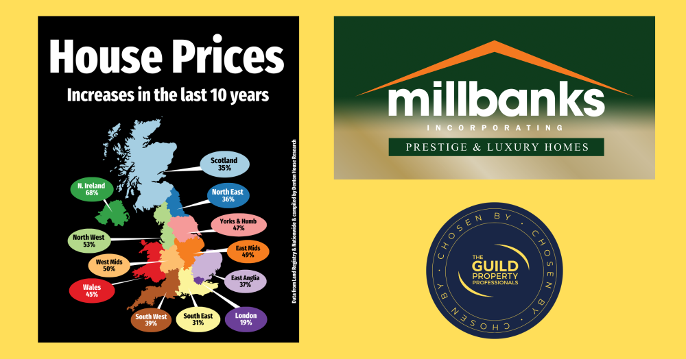
This map highlights how uneven UK house price growth has been over the last decade. While some regions have surged ahead, others have seen far more modest gains. It’s a clear reminder that national averages hide wide regional differences, and that property performance is always shaped by local markets rather than headlines.
When you look at the UK property market over the last 10 years, the picture is far from uniform. Northern Ireland has seen house prices climb by an eye-watering 68%, while London has managed just 19% in the same period.
· Northern Ireland: 68%
· North West: 53%
· West Midlands: 50%
· East Midlands: 49%
· Yorkshire & Humber: 47%
· Wales: 45%
· South West: 39%
· East Anglia: 37%
· North East: 36%
· Scotland: 35%
· South East: 31%
· London: 19%
This sort of map comparison is really useful because it shows how different areas have moved at very different speeds. It reminds us that property is always local. National headlines often talk about one big UK figure, but the reality is that your experience in Attleborough will be quite different from someone selling in Belfast, Bristol, Edinburgh, Manchester or London.
What stands out to you when you look at these figures?
If you'd like to find out what your home might be worth in 60 Seconds, please 'click' the banner ad below