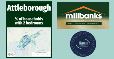
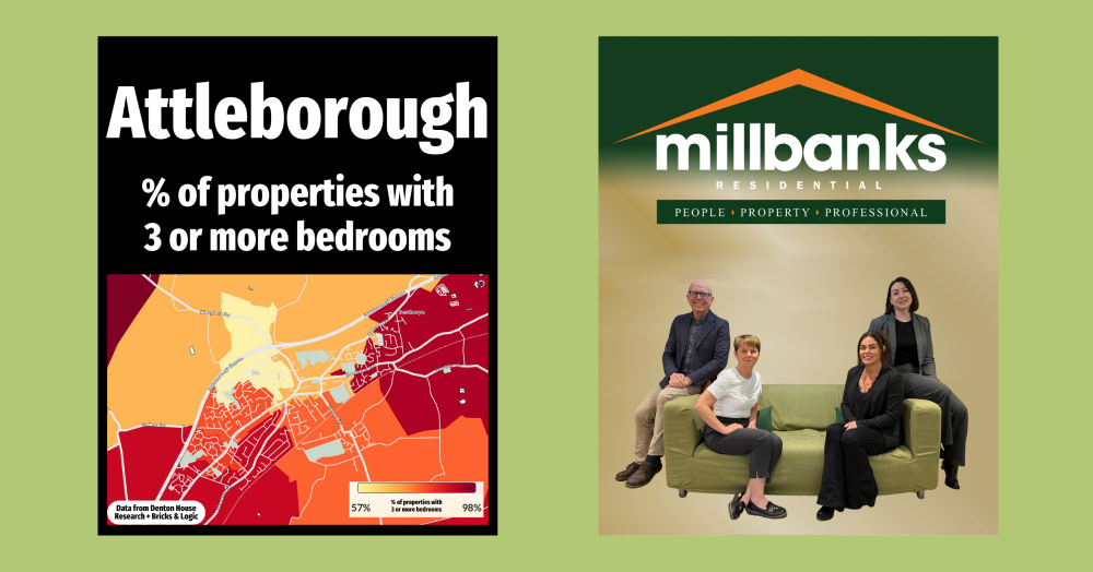
Hyperlocal Map with the % of homes that have 3 or more bedrooms
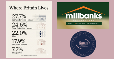
If you step back, a familiar pattern emerges. We rent when young, buy as life settles, and often own outright later on. Yet it’s not the same for everyone, with more people renting into later life. Property reflects life stages, choices and timing. To learn more, click the link and read on.
The Bigger Homes Tend to Sit on the Edge… But Not Always
This map highlights something we often see across the UK property market. The dark red’ish colour, the higher the proportion of homes with three or more bedrooms. The lighter shades, moving through orange to yellow, show areas with a greater mix of smaller one and two bedroom properties.
In many towns and cities, there is a natural pattern. Smaller homes, flats and terraces tend to cluster closer to the centre, where land is tighter and developments are older or more compact. As you move outwards, space opens up, and with it comes a higher proportion of larger family homes with more bedrooms.
Of course, property markets are never uniform. There are always pockets that break the trend. A modern development near the centre, or an older suburban area, can easily shift the pattern. That is why looking at local data like this really matters.
What this map shows is not the national trend, but how it plays out in [Grantham].
If you are a buyer, seller, landlord or tenant and want to understand what this means for you and your next move, feel free to get in touch for a straightforward chat about the local market.